Weill Cornell Medicine Design System
Design System creation and management for an academic institution
Overview
Weill Cornell Medicine (WCM) is a renowned medical school and medical system with over 100 websites, encompassing academic departments, research initiatives, patient-facing platforms, and lab sites. To maintain consistency, accessibility, and usability across this vast digital ecosystem, WCM developed a comprehensive design system. This case study highlights the process of creating, updating, and managing the design system, focusing on its evolution to meet new organizational goals and technology transitions, including a migration from Adobe XD to Figma.
My Role: As part of the original team responsible for the design system, I helped establish the initial framework and components. Later, I took on a leadership role in updating the design system to align with WCM’s new goals and aesthetics. I also led the migration from Adobe XD to Figma, ensuring a seamless transition for designers and developers.
Methods: Design Systems, Prototyping, UI Design
Tools: Adobe XD, Figma
Team: WCM’s Design Team, WCM’s front end dev team
Client: WCM IT Department
Project Timeline: July 2024 - November 2024

The Problem
With 100+ websites catering to different audiences—ranging from researchers and students to patients and lab staff—WCM’s digital presence faced several challenges:
Lack of Consistency: Each website had distinct design styles, making the overall WCM brand feel fragmented.
Scalability Issues: Managing multiple smaller websites required significant resources and created a disjointed user experience.
Platform Transition: WCM's IT department introduced a new aesthetic and layout to streamline and consolidate smaller websites into larger, cohesive platforms with a clear distinction between academic and non-academic sites.
Tool Migration: The design system initially built in Adobe XD needed to transition to Figma to align with WCM’s new design tools and workflows.
Goals
Establish Consistency:
Create a unified design language across 100+ websites, ensuring a cohesive visual identity and user experience while distinguishing academic and non-academic sites.Improve Scalability:
Develop a system to support the consolidation of smaller websites into larger, more manageable platforms.Enhance Accessibility:
Ensure all components and templates meet accessibility standards for a diverse audience, including patients, students, and researchers.Facilitate Collaboration:
Migrate the design system to Figma to improve workflows between designers, developers, and stakeholders through real-time collaboration.Optimize Usability:
Design an intuitive system for users with varying technical skills, ensuring clear navigation and differentiation between content types

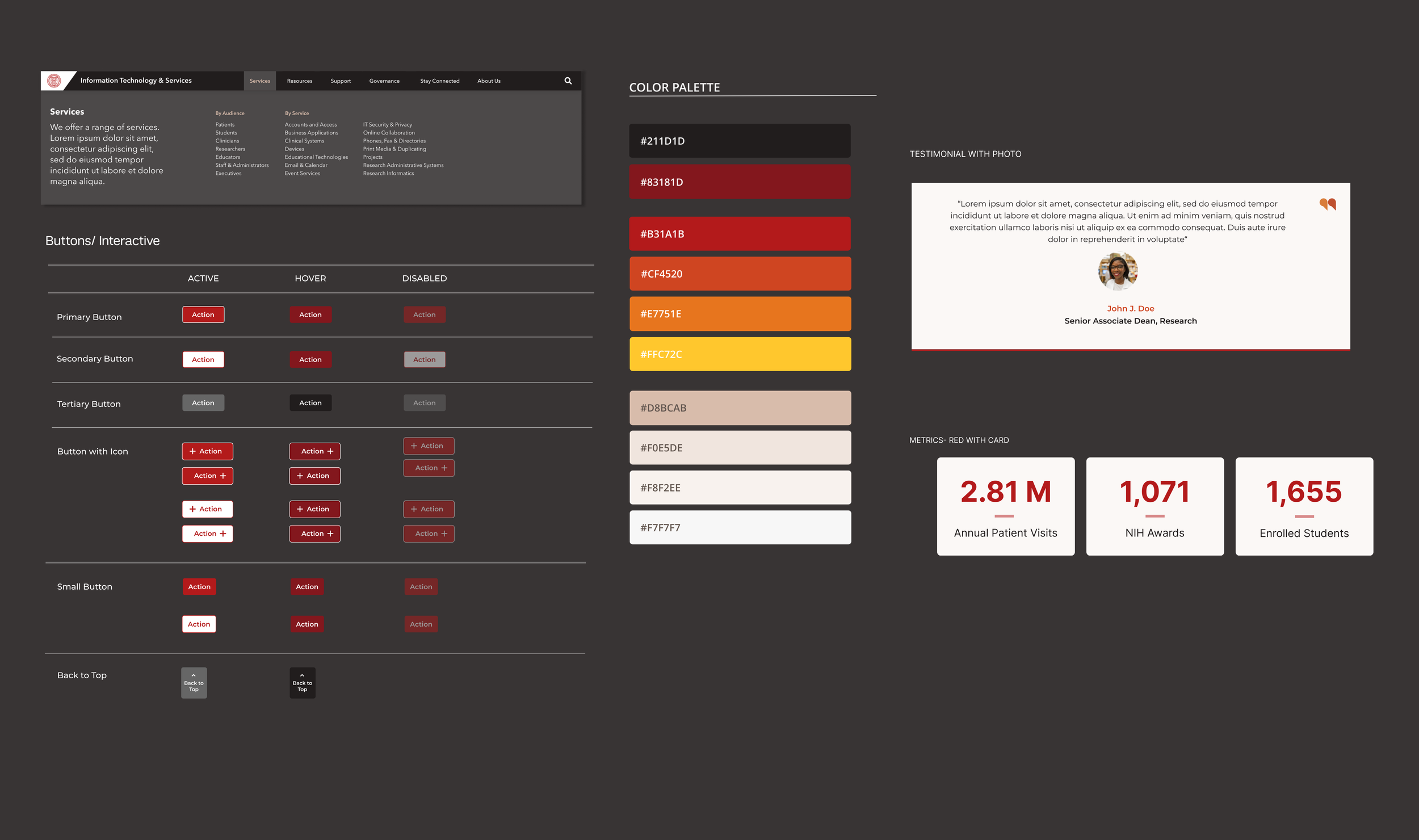
Color Palette

User Problem:
As an academic institution, Weill Cornell Medicine's branding adheres to a fixed color palette centered around deep maroons, vibrant reds, and bright yellows. While visually striking, the old color palette posed challenges when designing websites. The overuse of intense brand colors created overly colorful and distracting interfaces, with too many bright elements competing for attention. This issue became particularly problematic for users navigating websites with complex content, as the lack of visual hierarchy disrupted the user experience.

Design Solution
The updated color palette balances vibrancy with usability by focusing on:
Neutral Foundation: Neutrals and muted tones now form ~60% of the design, creating a clean, professional backdrop and reducing visual clutter.
Strategic Brand Colors: Bright reds and yellows are used sparingly as highlights to draw attention to key elements, such as buttons or headings.
Emphasis on Deep Maroon: The rich maroon, central to WCM’s identity, is prioritized for navigation and headers, reinforcing the brand while maintaining a polished aesthetic.
Improved Visual Hierarchy: Reduced reliance on intense colors ensures a clearer focus on content and a smoother user experience.
This refined approach enhances usability, aligns with WCM’s academic branding, and ensures the design supports content without overwhelming users
Typography & Spacing

Enhancing Readability
The updated typography system ensures clear hierarchy and readability with consistent font styles, optimized sizes, and accessible line heights. Standardized spacing creates visual clarity, with generous white space and consistent padding across components. Mobile-specific spacing ensures that content remains readable and navigable on smaller screens, with adaptable line heights and tighter yet balanced spacing for a seamless user experience across devices.
Grid System

Enabling Flexible and Scalable Layouts
User Problem
The consolidation of smaller websites into a unified platform introduced complexities in organizing and displaying content. Previously, individual websites had their own unique site architectures, which now needed to fit within a larger, standardized framework. This created a need for additional navigation options to help users navigate content at a more micro level while maintaining a cohesive structure.
Design Solution
Working in collaboration with a front-end developer, we designed an enhanced grid system to address these challenges:
Flexible Layout Options:
The grid system supports various layout configurations to accommodate diverse content needs, such as academic resources, research, and patient-facing information.Side Menu Navigation:
A new feature added to the design system, the side menu navigation provides users with a secondary navigation layer for specific sections or subpages. Consistent Structure:
The grid ensures alignment and spacing consistency across all pages, creating a unified visual experience that reinforces WCM’s branding.Responsive Design:
The grid system adapts seamlessly to mobile and desktop devices, ensuring layouts remain functional and navigable across all screen sizes.
Primary Navigation

Enhancing Usability for Consolidated Websites
User Problem
The consolidation of smaller websites into a unified platform created a need for an enhanced navigation system that could handle the increased complexity. The old navigation lacked dropdowns, clear labels, and additional navigation tools, making it difficult for users to find content efficiently. With the diverse needs of academic and intranet users, the navigation system required both high-level organization and localized navigation options to provide a seamless experience.
Design Solution
A comprehensive navigation system was developed, introducing new features and forms of navigation to address both macro- and micro-navigation needs:
Primary Navigation Updates:
Dropdown Menus and Clear Labels: Dropdowns were added to create a structured, multi-level navigation system, allowing users to explore subcategories without leaving the main menu.
Distinct Aesthetics:
The Academic Navigation Menu has a lighter aesthetic and WCM branding, to be used for WCM’s academic websites (i.e. Graduate School, Phd Program)
The Intranet Navigation Menu features a darker aesthetic, aimed towards websites for staff and administrative users (i.e. IT Website)
Components Library

Components Library: Managing, Prototyping, and Migrating to Figma
User Problem
With the scale of Weill Cornell Medicine's design system, maintaining a consistent and reusable component library was essential to streamline workflows for designers and developers. Previously, components were not fully prototyped for interactive use, limiting their usability. Additionally, the migration from Adobe XD to Figma required a complete rebuild of the component library, ensuring that all components were optimized, interactive, and ready for real-world application
Design Solution As the sole designer, I managed and migrated the component library from Adobe XD to Figma, ensuring it was interactive, modular, and easy to use:
Standardized Components:
Created and organized core UI elements like buttons, accordions, inputs, and dropdowns with clear design specifications for states (e.g., active, hover, disabled).Interactive Prototypes:
Prototyped components in Figma to demonstrate functionality, enabling real-time testing and improved usability for designers and developers.Figma Migration:
Rebuilt the entire library using Figma’s features like auto-layout and variants, improving flexibility, scalability, and collaboration across teams.
The Design System in Action

ITS Website Redesign with New Design Sytem
The redesigned ITS website showcases the design system's flexibility and consistency in action. The homepage and FAQ page utilize core components such as accordions, buttons, and cards to organize content efficiently and improve user navigation. The updated typography, refined color palette, and flexible grid system provide a clean and professional layout, ensuring clarity for users with varying technical needs. New features like dropdown navigation and streamlined support sections enhance usability, demonstrating how the design system scales seamlessly across complex, content-rich pages
Wrap-up: Reflection & Impact
The Weill Cornell Medicine design system brought clarity and scalability to WCM’s digital presence by introducing improved navigation, a flexible grid system, and a refined component library. These updates enhanced usability across both academic and non-academic platforms, providing users—whether patients, students, or researchers—with clearer pathways to access content. The institution also gained a more cohesive and maintainable digital foundation.
One of the key challenges—and highlights—was migrating the design system to Figma. Adapting to this new tool allowed me to rebuild, prototype, and optimize components for greater collaboration and efficiency across teams. Looking ahead, the design system will support WCM’s education website consolidation, ensuring it continues to meet the institution’s growing needs with flexible, user-centered solutions.