RISE Wellness Tracker
UI/UX Design for a mobile wellness and mental health tracking app
Product Overview
RISE is a mobile app designed to help users keep track of their mental health and wellness. It was developed in collaboration with a psychiatric clinical study at Weill Cornell Medicine (WCM). RISE provides personalized mental health insights and resources for its users in addition to helping WCM gain valuable research for their studies in psychiatry.
Roles: UI/UX Designer Platform: Mobile App
Methods: User Interviews, Journey Mapping, Wireframing, Usability Testing, User Flows, Prototyping
Tools: Adobe XD, Userlytics
Team: WCM (Weill Cornell Medicine’s) App Dev Team, WCM’s Psychiatry Research Team
Client: WCM Psychiatry Department
Project Timeline: April 2024 - August 2024

The Problem
Mental health challenges are widespread, yet many individuals lack accessible tools to monitor and manage their emotional well-being. Collaborating with Weill Cornell Medicine's psychiatry research team, we recognized the need for a mobile app that not only supports users in tracking their mental health but also streamlines data collection for clinical studies.
The existing system for data collection was done through email correspondence and qualtrics, a third party survey platform, which in addition to privacy concerns, can be inefficient and inaccessible.
Goals
Create a user friendly mobile app that allows users to track their mental health
Provide users with valuable insight on their mental health trends and recommendations to improve their overall mental health and wellness.
Steamline and modernize data collection for clinical studies for WCM’s research teams
Foster higher user engagement and participation in clinical studies
Potential User Flow

Key Features for Wireframes
Daily Survey: A quick, four-part survey tracking anxiety, depression, sleep and appetite.
Trends Dashboard: Visual graphs showing weekly and monthly trends.
Personalized Results: Tips based on user data, such as journaling prompts or mindfulness exercises.
Clinician Data Export: Backend capabilities for exporting aggregated anonymized data.

Branding & Styling

Initial Branding Challenges
WCM Branding Constraints:
WCM’s official branding guidelines emphasized bold, intense colors such as bright reds and deep maroons. While effective for a corporate and academic presence, these colors were not conducive to the calming and supportive tone needed for a mental health app. Too much use of these colors made the elements on the screen too “loud” and created a confusing visual hierarchy.Initial Styling & Branding Missteps:
Earlier interactions of the RISE app used a more neutral and soft color palette with colors (e.g. navy, soft blues, lavender) and while this was well received by the client and test users we found out after consulting WCM’s branding team that this color palette did not align with WCM’s branding. Given its connection to a WCM clinical study, the app’s branding needed to align with WCM’s.
Revised Approach
WCM’s branding colors were used in elements like the CTA buttons where a strong pop of color creates an eye catching focal point.
Survey results in the clinical study were categorized by intensity levels (low, moderate, high) and required color coding. To balance WCM’s bold branding colors, we used soft, muted tones for results and charts
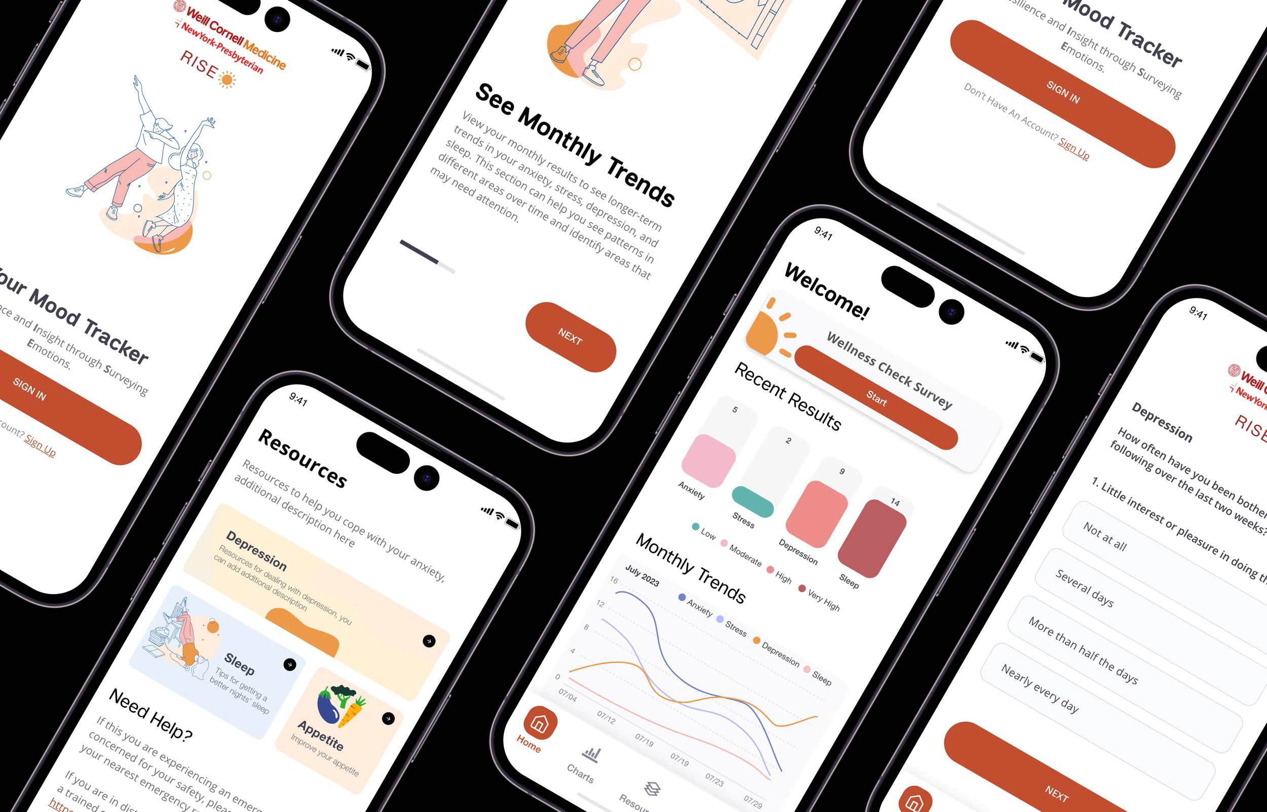
Introduction Screens: Onboarding New Users

User Problem : New users often struggle to understand an app’s purpose and features right away, leading to confusion or drop-off. For RISE, it was critical to provide a smooth onboarding process that clearly explained the app’s goals, benefits, and how to use it while maintaining engagement.
Design Solution : Introduction Screens The introduction screens guide users through the onboarding process, explaining key features of the app and how they can be utilized in the user’s mental health tracking journey.
Key Features :
Illustrations: Simple, calming illustrations reinforce the app’s wellness focus while making the screens visually engaging.
Progress Indicators: Pagination dots at the bottom provide clarity on the onboarding flow, giving users a sense of progression.
Clear CTAs: Each screen includes a “Next” button for easy navigation, with the option to “Skip” for users who prefer to explore the app independently
Daily Survey Flow: Simplifying Mental Health Tracking

User Problem: Users need a simple and intuitive way to track their mental health that wasn’t overwhelming. The survey process had to be quick yet thorough, capturing key metrics (anxiety, stress, depression, and sleep) in a way that encourages consistent engagement.
Design Solution : An Intuitive Daily User Flow A central part of the RISE app and WCM’s clinical study is the “Wellness Check Survey”. We wanted to create an intuitive user flow that encouraged users to take this survey daily.
Key Screens & Features:
Dashboard Entry Point:
Users are greeted with a friendly “Hello, Username!” and a prominent "Wellness Check Survey" button, making it clear where to start.
The dashboard also displays “Recent Results” (color-coded by intensity) and “Monthly Trends” graphs, motivating users with a preview of their progress
Survey Questions:
Multiple-choice answers are structured around frequency (e.g., “Not at all” to “Nearly every day”), making it easy to respond quickly. Language was revised after user testing to ensure that the survey was easy to read and understand.
Results Summary:
Scores are color-coded (e.g., green for low, red for high) to provide an at-a-glance understanding of intensity levels.
Descriptions of each result (e.g., "Moderate Level of Anxiety") are included alongside actionable recommendations, such as lifestyle changes or using the app’s “Resources” section for support.
Navigation and Accessibility:
The bottom navigation bar allows users to easily explore “Charts”, “Resources”, or their “Account”, enhancing usability beyond the survey.
Enhanced Features: Visual Insights, Resources and Privacy

User Problem: The original survey format (Qualtrics) lacked visual appeal, interactivity, and additional user benefits, such as insights or mental health resources. This static design led to lower user engagement and limited its usability beyond raw data collection. Additionally, users expressed concerns about privacy and how their sensitive mental health data was handled, which needed to be addressed transparently.
Design Solution : An Intuitive Daily User Flow The updated design provides an intuitive, user-centric experience that improves upon the limitations of Qualtrics with these key enhancements:
Visual Insights with Charts:
The “Charts” screen replaces static survey reports with dynamic visuals with an option to filter charts by category (anxiety, depression, stress, sleep)
Resources for Actionable Support:
Unlike Qualtrics, which only collects responses, RISE includes a “Resources” screen offering curated tips and recommendations for managing mental health issues. In the old system these resources would’ve been relayed through email.
Privacy Transparency:
The “Privacy Policy” section was designed to address user concerns about data security. It includes collapsible sections explaining:
What information is collected.
How it is used.
To whom it is disclosed.
How it is kept secure.
Reflection
Designing RISE for Weill Cornell Medicine’s Psychiatry team was a unique challenge that combined the need for clinical rigor with user-centered design. By moving away from a static survey tool like Qualtrics to an interactive mobile app, the team addressed critical pain points such as engagement, usability, and accessibility. Balancing the app’s usability with institutional branding constraints required iterative testing and thoughtful design choices, ensuring both client and user needs were met effectively.
Key takeaways from this project include:
Empathy in Design: Understanding the challenges faced by both users (managing mental health) and researchers (needing accurate, consistent data) shaped the final product.
Iterative Problem Solving: Adjustments to the branding, data visualization, and feature set showed the importance of flexibility in design.
Holistic Solutions: Going beyond data collection by offering resources and insights ensured the app was both a tool for research and a meaningful resource for users.
Impact
The introduction of RISE has had a measurable positive impact:
Increased Engagement: The interactive design and daily reminders significantly improved survey completion rates compared to Qualtrics, providing researchers with a more robust dataset for studying mental health trends.
User Empowerment: By offering visual insights, actionable resources, and a sense of progress, the app fostered greater user engagement and a proactive approach to mental health tracking.
Data Transparency: The emphasis on privacy and security reassured users about sharing sensitive information, improving trust and participation in the study.