CAMERA Web App
UI/UX Design for a global emergency disaster preparedness web app
Overview
CAMERA is a web app designed for disaster relief staff, providing essential tools to assess and enhance the emergency preparedness levels of their city and identify critical gaps in these services. The app serves two main user groups: city disaster relief staff, who need city specific data for decision-making, and admin staff, who analyze trends and monitor preparedness levels for research purposes.
I was the sole designer on this project which was created in collaboration with Weill Cornell’s Emergency Medical Research Team who created a system to evaluate emergency preparedness and wanted an app which would bring this to their user base globally.
Roles: UI/UX Designer Platform: Web App
Methods: User Interviews, Journey Mapping, Wireframing, Usability Testing, User Flows, Prototyping
Tools: Adobe XD, Userlytics
Team: WCM (Weill Cornell Medicine’s) App Dev Team, WCM’s Emergency Medical Research Team
Client: Weill Cornell Medicine’s Emergency Medicine Department. Timeline: January 2023- April 2023

The Problem
The primary problem identified was the lack of a centralized platform for disaster and medical relief staff to access and monitor their city’s emergency preparedness. WCM’s existing system involved receiving emergency preparedness data and results through pdf and email, which makes it difficult for disaster relief staff to organize their data and identify weak points. This also made it difficult for admin staff to track trends in different cities for research.
Goals
Create an intuitive web app for both user types.
Centralize data for easy access and management.
Provide actionable insights through data visualization.
User Interviews
To ensure the app effectively supports disaster relief leadership, I conducted user interviews with emergency relief staff, disaster response coordinators, and researchers specializing in disaster preparedness. These conversations provided critical insights into the challenges of coordinating relief efforts, managing resources, and communicating during crises.
Interview Process
Participants: Emergency response staff and , logistics coordinators, and disaster preparedness researchers.
Methodology: Semi-structured interviews focusing on workflows, decision-making, and pain points.
Takeaways
Fragmented Information: Leaders struggle with multiple tools and data sources, slowing response times.
Real-Time Coordination Needs: Rapid decision-making requires up-to-date resource tracking and situational awareness.
Communication Barriers: Effective messaging is crucial but often hindered by outdated systems or manual processes.
Data-Driven Insights: Researchers emphasized the importance of predictive analytics to improve planning and response strategies.

Personas & Potential User Flows


Key Features for Wireframes
Based on the user flows, we identified several essential features to include in the low-fi wireframes for both user flows:
Dashboard Home : The dashboard provides a concise overview of the most relevant data for the respective user groups.
City Disaster Relief Staff: Overall performance score, graphs and charts of results, overview of recommendations.
App Admin: Index of cities, city status updates and research specific metrics.
Side Navigation: Fixed side navigation to ensure that users can navigate between sections easily.
Graphs and Data Visualization:
Charts and graphs that visually represent preparedness metrics
Options to customize views, allowing users to filter data by specific criteria
User Group Specific Features:
City User:
Detailed Results Page: An organized layout that presents metrics clearly and in more detail than on the dashboard home page with options to filter by section.
App Admin:
Comparisons Page: Users are able to compare data between different cities to quickly analyze emergency preparedness across cities
User Management Tools: Tools that help admins with onboarding (new city creation, survey assignment), support and monitoring of each city’s status in the evaluation timeline

Usability Testing
Testing Methodology
Participant Recruitment: We engaged diverse users from various countries by connecting with WCM’s global partners. Since CAMERA is a global app, we wanted to make sure the users recruited for testing reflected this.
Remote Testing: Conducted sessions through Userlytics and Zoom.
Scenario-Based Tasks: Created realistic workflows to reflect actual app use for both user groups (i.e. Create a new city, Check the ICS score of your city.)
Usability Metrics: Measured task success rates, completion times, and user satisfaction.
Testing Results & Insights
Overall Ease of Use: Most participants found the CAMERA web app intuitive and easy to navigate
Navigation Insights: The design was straightforward, with high task success rates, allowing users to complete scenarios efficiently.
Language Challenges: Some users struggled with language barriers and confusion with unclear terminology.
Localization Requests: Participants expressed a need for more localized content and terminology to enhance understanding, particularly in high-stakes scenarios.
Conclusion:
The CAMERA web app is generally user-friendly, but incorporating localized content is crucial to enhance the experience for international users.

Designs for App Admin Staff


User Problem: Managing emergency preparedness evaluations across multiple cities and users can be a daunting task. Researchers and administrators need a centralized system to track each city's metrics, monitor evaluation statuses, and assign responsibilities to city staff. However, previous methods were fragmented and inefficient.

Comparisons Page: Streamlining City to City Benchmarking
User Problem: Comparing emergency preparedness data between different cities is a key for researchers to establish benchmarks. Without a standardized tool, comparisons were time consuming and tedious. Users needed an intuitive interface to filter and compare cities based on specific preparedness categories, such as healthcare or infrastructure, while also visualizing these insights in a clear and actionable way.
Design Solution: The Comparisons Page was designed to provide a seamless and interactive experience for benchmarking cities:
City-to-City Comparisons: A straightforward dropdown system allows users to select two cities to analyze side by side. This feature makes it easy to assess their overall scores, gap classifications (e.g., "Moderate" or "Major"), and preparedness metrics.
Filter by Section: A filtering option enables users to focus on specific disaster preparedness areas, such as healthcare or transportation, giving them more targeted insights into performance.
Actionable Visuals: The use of color-coded gap bars simplifies complex data, making it easy to identify which cities or sections need the most attention.

Cities & User Management: Simplifying Monitoring and Data Collection
Design Solution: The Cities and User Management Pages were designed to provide researchers and administrators with a centralized platform to efficiently track and manage all aspects of the emergency preparedness evaluation process.
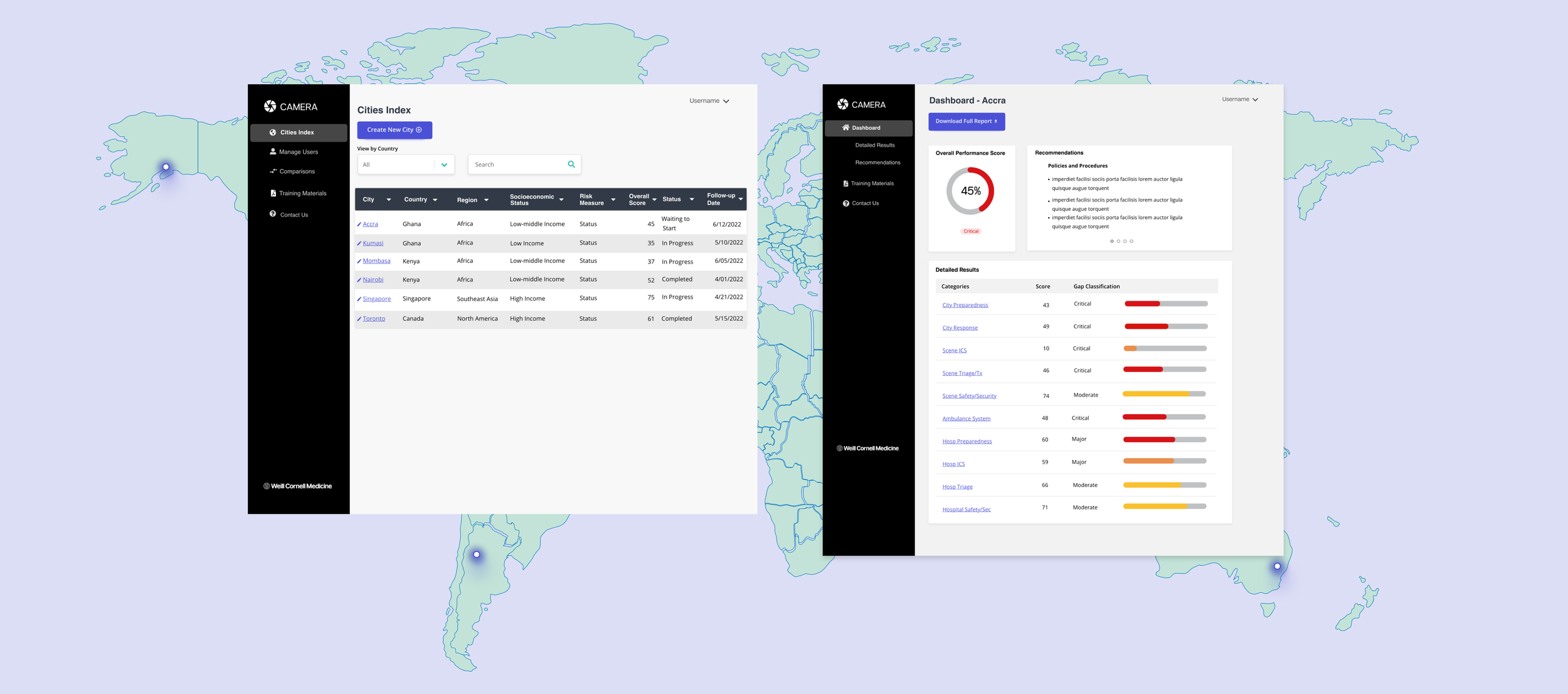
Cities Index Page: Provides a centralized hub where users can view and manage all cities involved in the evaluation process.
Key Features:
Monitoring Metrics: Each city’s preparedness metrics, such as scores and evaluation statuses, are displayed in an organized list.
Filter by Country: A filtering option allows users to sort cities by country, enabling quick access to regional data.
Create New Cities: A clear, accessible button allows users to add new cities to the evaluation process seamlessly
User Management: Focuses on managing the personnel involved in each city’s evaluation process
Key Features:
Assigning Surveys: Users can assign specific surveys to city staff members, ensuring evaluations are conducted efficiently.
Tracking Status: A status indicator shows whether assigned surveys have been completed or are still pending.
Create New Users: Administrators can easily add new team members to the system, ensuring that city evaluations are properly staffed
Designs for Disaster Relief Staff

Dashboard: Centralizing Emergency Preparedness Data
User Problem
Disaster and medical relief staff in cities faced significant challenges due to the lack of a centralized platform for accessing and monitoring their city’s emergency preparedness. WCM’s existing system relied heavily on sharing emergency preparedness data through PDFs and email, which made it difficult for relief staff to organize information, identify weak points, and prioritize action. Additionally, administrative staff struggled to track trends and compare data across different cities for research purposes, limiting their ability to make data-driven decisions and support preparedness improvements

User Problem
Through user testing with emergency preparedness teams across multiple regions, we learned that users faced significant challenges in navigating performance metrics and accessing training materials. Many users in developing countries, especially those with limited tech literacy, struggled to interpret complex data or find the resources they needed to improve their workflows. The lack of a centralized platform exacerbated these issues, leaving users unable to identify gaps or build capacity effectively.
Design Solution
The Dashboard provides a centralized interface that highlights key insights from individual app pages at a glance, with the option to explore detailed data as needed.
Key Features:
Performance Overview:
Displays the city’s overall preparedness score using a gauge and status indicator, giving users an instant understanding of readiness levels. Users can drill down for a detailed breakdown of contributing factors.Downloadable Reports:
A “Download Full Report” button provides quick access to comprehensive data for offline use and sharing with stakeholders.Integrated Navigation:
A sidebar menu links seamlessly to all app pages, allowing users to explore detailed results, recommendations, and training materials without losing context

Additional Pages: Supporting a Global and Diverse User Base
Design Solution
The Detailed Results and Training Materials pages were designed based on insights from user testing to ensure accessibility and usability for a global and diverse audience:
Detailed Results Page:
Filters and visual bar graphs simplify data interpretation, enabling users to quickly identify and prioritize weak points, such as funding or protocol gaps.
Drill-down features provide more context for advanced users, while keeping the interface intuitive for those with less experience.
Training Materials Page:
A centralized library organizes essential resources like manuals, lectures, and presentations, offering users quick and structured access to knowledge.
Customizable folders and upload functionality ensure flexibility, allowing admin teams to adapt the library to local contexts.
Simple navigation ensures ease of use, addressing feedback from user testing about the need for low-barrier interfaces.
Impact
Enhanced Decision-Making:
Real-time data enabled disaster relief staff to make informed, swift decisions, significantly reducing response times during crises.
The intuitive design and visual data representations allowed for quick comprehension of critical information.
Increased Preparedness
The admin dashboard supported in-depth trend analysis, helping to identify gaps and prioritize areas for improvement.
This empowered a proactive approach to emergency management
Next Steps
Different language options to accommodate global users
Survey Integration
Mobile App